User Interface Elements
This page offers a comprehensive overview of all Kontakt user interface elements and their function.
There are a number of common interface elements that are used throughout Kontakt. The handling of these common elements is always the same, but the context in which they appear will vary. The following overview highlights the main elements and explains how to interact with them using a mouse.
Name | Example | Description | Interactions |
|---|---|---|---|
Unipolar Knob with Value Field | 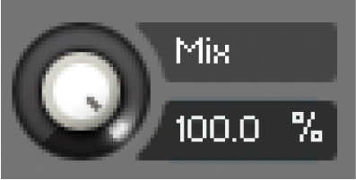 | Used to adjust parameters in the range of 0% to 100% from left to right. |
|
Bipolar Knob with Value Field | 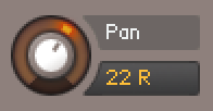 | Used to adjust parameters in the range of -100% to +100% from left to right. The center position is 0%. |
|
Unipolar Slider | 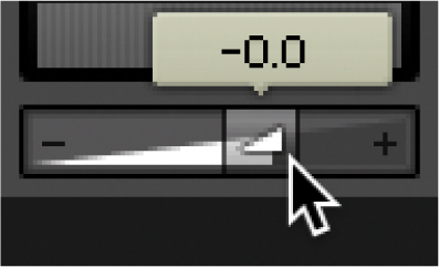 | Used to adjust parameters in the range of 0% to 100% from left to right. |
|
Bipolar Slider | 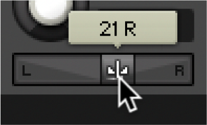 | Used to adjust parameters in the range of -100% to +100% from left to right. The center position is 0%. The value is displayed above the slider control. |
|
Unipolar Slider and Meter display | 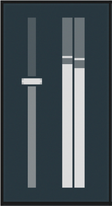 | Used to adjust parameters in the range of 0% to 100% from bottom to top. The meter displays the signal as determined by its respective slider. |
|
Dropdown Menu Arrow | 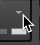 | Used to open a dropdown menu relating to the respective control or setting. |
|
Dropdown Menu Button | 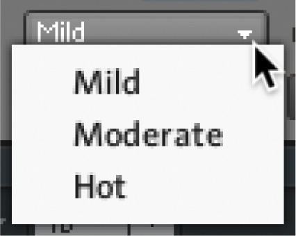 | Buttons with arrows indicate a dropdown menu. Click the button to open a menu that provides options relating to the respective section or function. |
|
Dropdown Menu and Sub-menus | 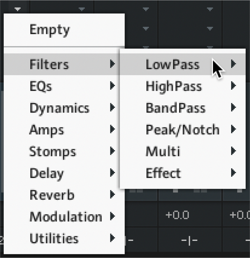 | Some menus have additional sub-menus; these will be indicated with a small right arrow next to the name of the menu item. Moving the selection bar to one of these items will open the respective sub-menu. |
|
Sync Tempo Menu | 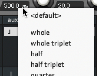 | Synchronizes time-related parameters to the song tempo. |
|
Function Button |  | A button represents a parameter that can be switched on and off. Each click on a button toggles it between those two states. The current state of a button is being indicated by its background color; if a parameter is activated, its button will be highlighted. |
|
Option Button |  | Opens a menu or dialog with additional options. |
|
Tab Button | 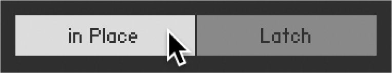 | Switches between two options. Each click on a button toggles between those two states. |
|
Banks Tabs | 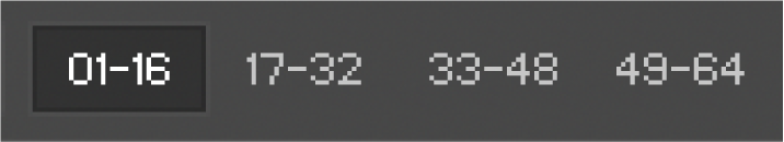 | Used to select one of four pages of banks. |
|
Value Field | 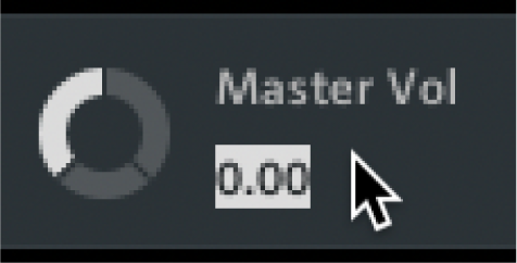 | Some controls contain editable numeric fields that allow you to manually enter values. |
|
Value Arrows | 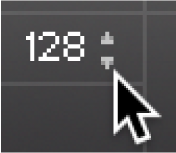 | Hovering over a value field can display small up/down arrows on right side of the value. Click the arrows to increase or decrease the value incrementally. Only available for some controls. |
|
Search Field | 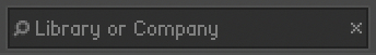 | Enter names or key words to help search libraries and databases. |
|
Scroll Bar | 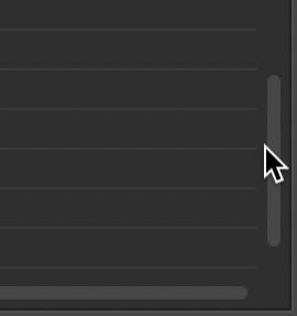 | Scroll through content using the horizontal and vertical scroll bars. |
|
Checkbox | 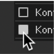 | Used to select and unselect various options and settings. |
|
Close Button (x icon) | 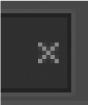 | Used to clear a search field, or close a window or module |
|
Info Pane
The Info Pane displays a short help text for whichever control the mouse is currently hovering over. The Info Pane area is located at the bottom of the Kontakt window. It can be used to quickly understand the function of a particular knob, button, menu entry, or any other user interface element. Hover a mouse over a control while the Info Pane is visible and a description of the control will be displayed.
To display the Info Pane:
Open the Workspace menu in the Kontakt header.
Click on the Info option.
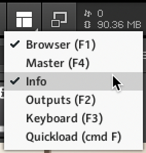
The Info Pane is activated and displays in the window.

Setting the Language of the Info Pane
The Info Pane help is available in five languages: English, German, French, Spanish and Japanese. Language preferences are set via the Language drop-down list in the Interface tab of the Options dialog. Restart Kontakt after selecting a new language. If you select Automatic the language follows the language selection of your operating system. For more information, see Interface Tab.
Saving and Loading Presets
Presets allow you to save your settings in any part of Kontakt and recall them in another context. The Kontakt environment is split up into modules, and most of these offer a preset drop-down menu that allows you to manage presets for the respective module. Loading a preset in a module doe not affect the other modules in your Instrument, allowing you to freely combine different presets into your own Instruments.
Presets are saved in files (file extension: .nkp) which reside in a series of sub-folders within a “presets” folder. Kontakt creates two of these preset folders on your system: one contains the factory presets and is located in a directory which is not writable by normal users; the other one resides within your home directory and will be used to store your own custom presets. Kontakt will create this user presets folder when you first start it up.
Factory and user preset folders will be created in the following folders:
Windows Factory | C:\Program Files\Common Files\Native Instruments\Kontakt 7\presets |
Windows User | C:\Users\[username]\Documents\Native Instruments\Kontakt 7\presets |
Mac OS X Factory | Macintosh HD/Library/Application Support/Native Instruments/Kontakt 7/presets |
Mac OS X Users | Macintosh HD/Users/[username]/Documents/Native Instruments/Kontakt 7/presets |
Kontakt provides a large number of ready-made presets for most of its modules, which are good starting points for your own settings. Browse the Factory preset list of a module when you have a specific task in mind and don’t know where to begin.
Preset management in Kontakt takes place within each module’s preset drop-down menu. You can access this by clicking on the drop-down menu labeled Pre or Preset, which is located on the left side of each module. It contains all preset files that were found in the respective preset folders on your hard disk, with further subdirectories (if any) appearing as sub-menus. The Save Preset entry at the bottom of the menu will open a dialog, which asks you for a filename. Enter a descriptive name and click Save, and your settings will be available within the User submenu of the presets drop-down menu. This will not work, however, if you change the path in the save dialog, so it is recommended that you always save your presets to the default path.